Mastering Color Management: The Key to Achieving Print Perfection
The Key to Achieving Print Perfection
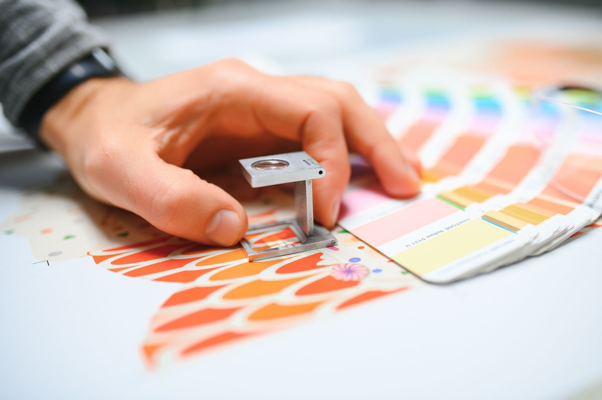
What Is Colour Management Printing?
Colour management printing(also spelled color management in US English) is the process of controlling colour reproduction across different devices to ensure consistency and accuracy. It involves colour spaces (RGB, CMYK, Lab), calibration standards, and policies for preserving, converting, or discarding colour profiles. Proper colour management printing ensures your brand colours look exactly as intended from screen to printed piece. Request a colour consultation →
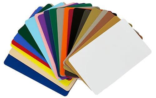
In the world of digital and print design, colour is not just a visual element; it's a crucial part of communication. Whether you're creating vibrant posters , intricate packaging , or high-impact marketing materials , ensuring your work is in the correct colour space is essential. The colour space you choose directly impacts how your design will appear on different screens and in print, making it vital to understand your intent and how colour management printing tools can help you achieve it. From graphic designers to print shops , navigating the complexities of colour management printing is a critical skill that can make or break a project.
Why Being in the Correct Colour Space Matters for Colour Management Printing
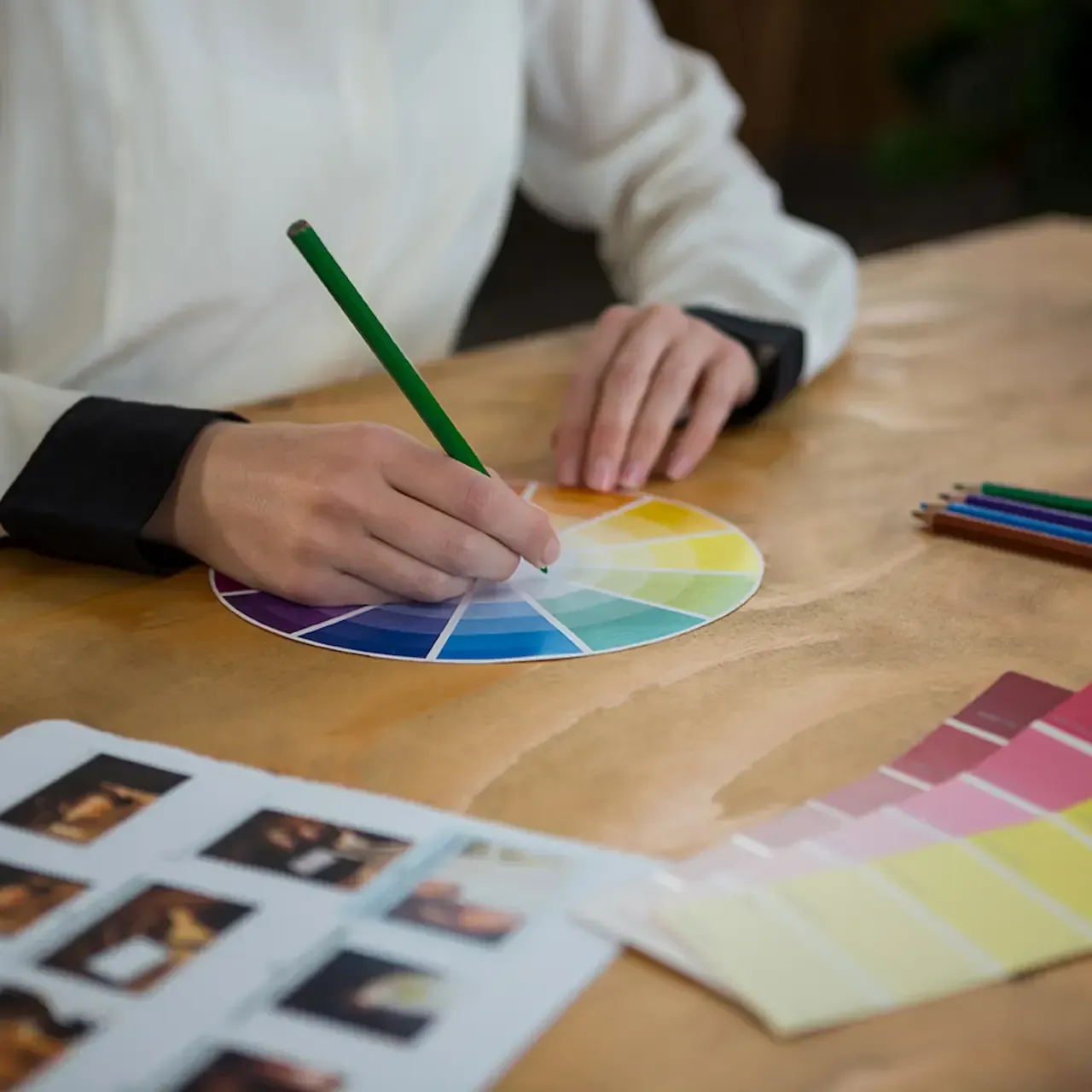
Colour spaces are the foundation of how we perceive and reproduce colour in digital and print formats. A colour space defines the range of colours that can be displayed or printed, and choosing the right one ensures that your design looks its best across all mediums. For instance, working in sRGB might be ideal for web content, but for high-quality prints, Adobe RGB or even ProPhoto RGB could be more appropriate due to their broader colour gamuts. Understanding your project's intent—whether it's to be viewed on a screen or printed on paper —will guide your choice of colour space, ensuring that your colours remain consistent and vibrant through proper colour management printing.
Colour Management Tools: Keeping Your Colours in Check
To navigate the complexities of colour management printing, several tools are available that help ensure your colours are accurate and consistent. Software like Adobe Photoshop, Illustrator, and InDesign offers robust colour management settings that allow you to preserve embedded profiles, convert to a working space, or discard profiles based on your needs. These tools give you control over how colours are managed throughout the workflow, helping to prevent colour shifts that could lead to unexpected results.
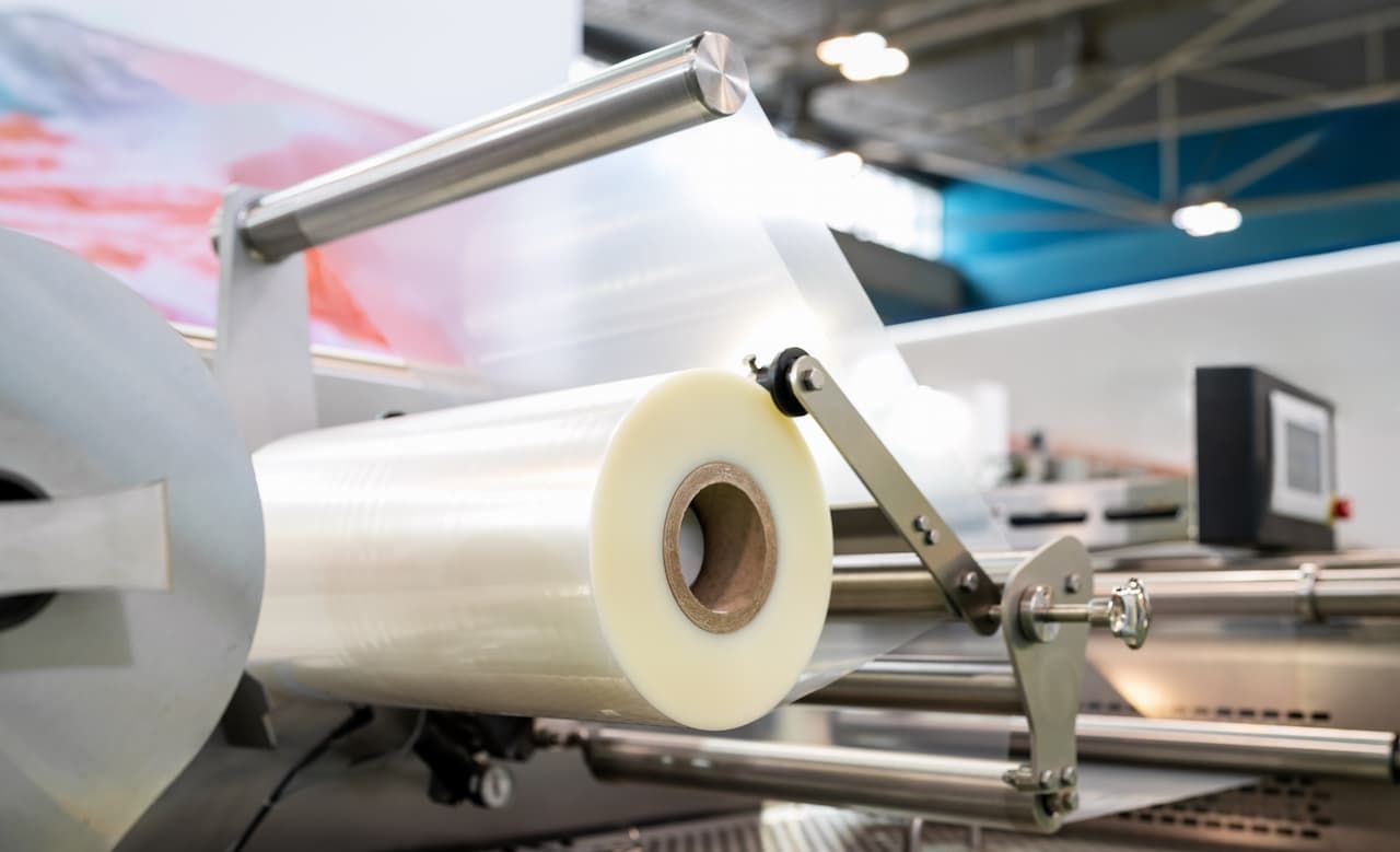
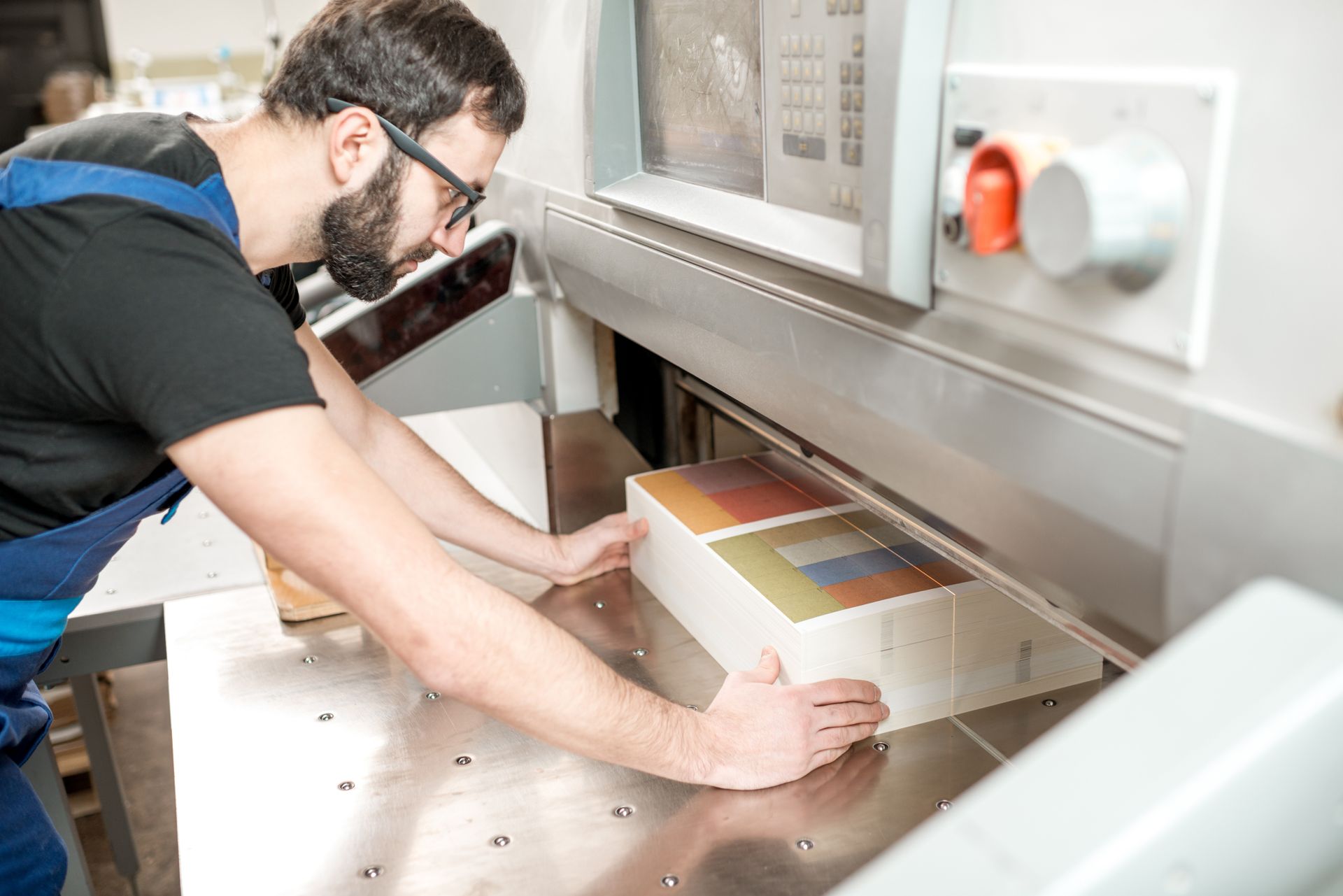
Challenges Print Shops Face in Colour Management Printing
For print shops , colour management printing is both an art and a science. The challenge lies in maintaining consistency across different devices, materials, and processes. A file might look perfect on a designer's monitor but could print with noticeable colour discrepancies if not managed correctly. Print shops often deal with files from various sources, each with different embedded profiles. Deciding whether to preserve, convert, or discard these profiles can be a complex decision that impacts the final product's quality. Additionally, the transition from RGB to CMYK for printing introduces further challenges, as the conversion process can result in colour shifts if not handled carefully.
Preserve, Convert, or Discard: Which Colour Management Policy Is Right for You?
When it comes to setting colour management printing policies, one of the most crucial decisions is whether to preserve embedded profiles, convert to a working space, or discard profiles altogether. Each option has its advantages and disadvantages, depending on the nature of the project and the desired outcome. Preserving embedded profiles is often the safest bet, especially when working with files from multiple sources, as it maintains the original colour intent. Converting to a working space can provide uniformity across all files, but it may result in colour shifts. Discarding profiles simplifies the workflow but at the cost of potential colour accuracy.
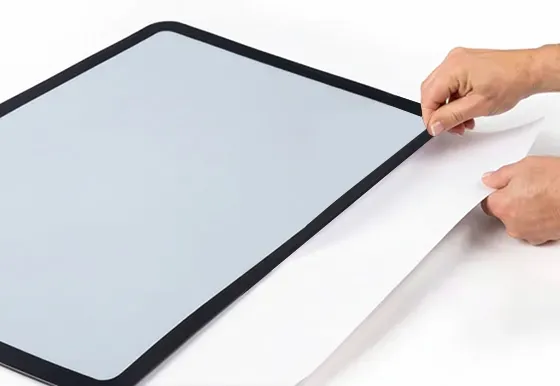
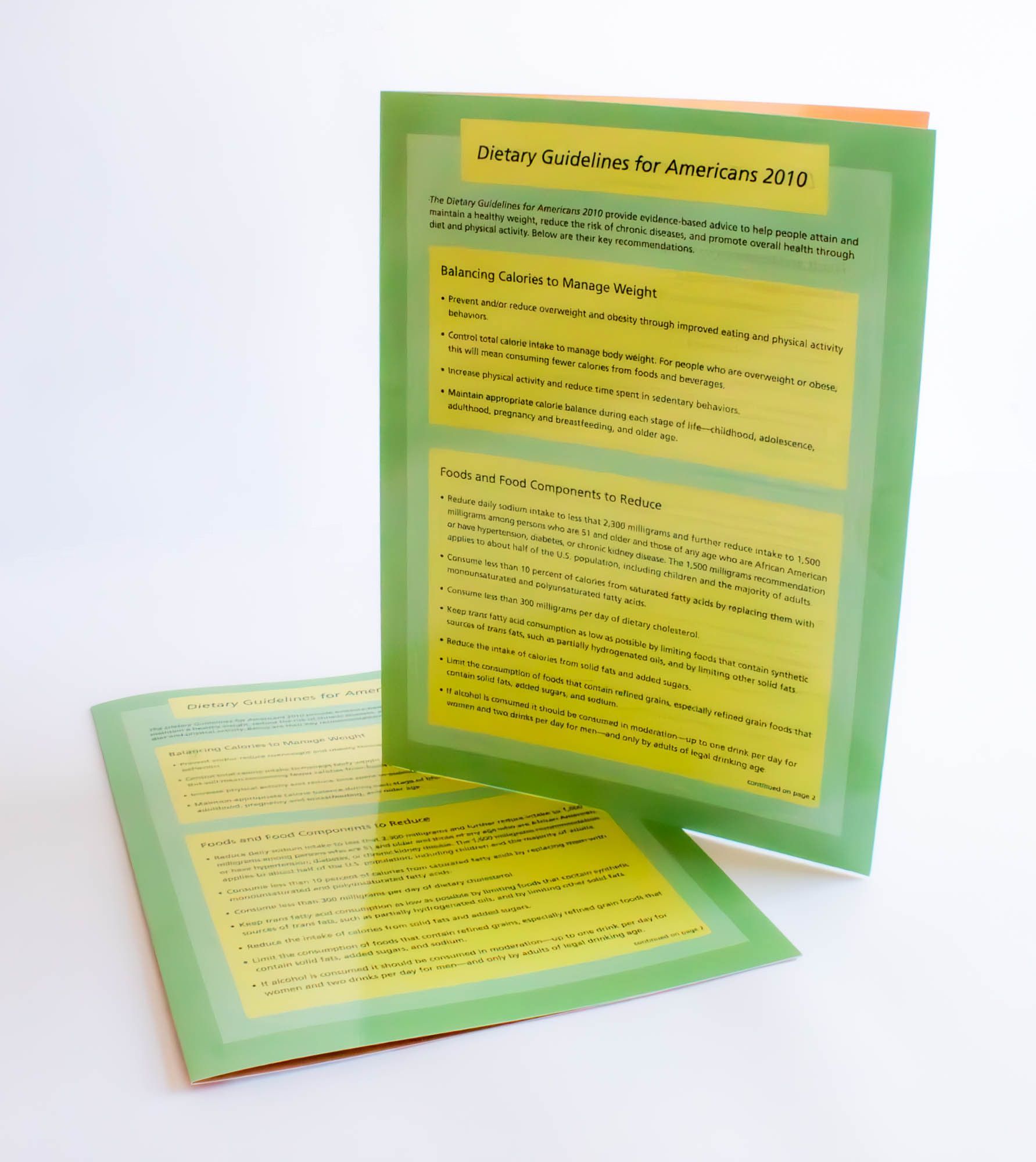
Practical Application: Colour Management in Custom Printing at LamPro
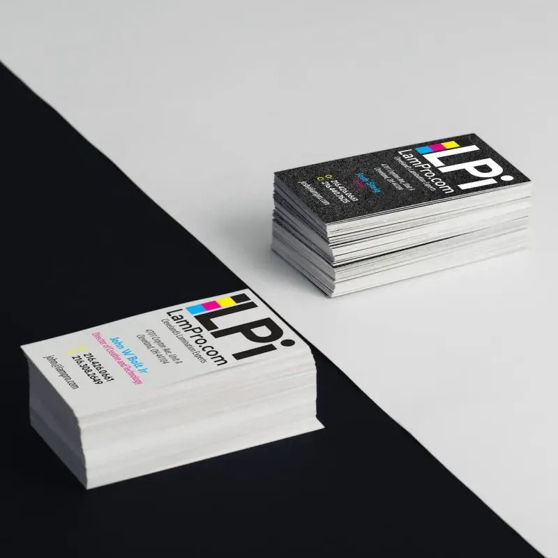
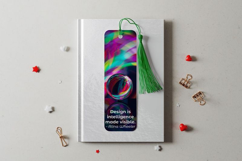
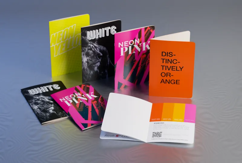
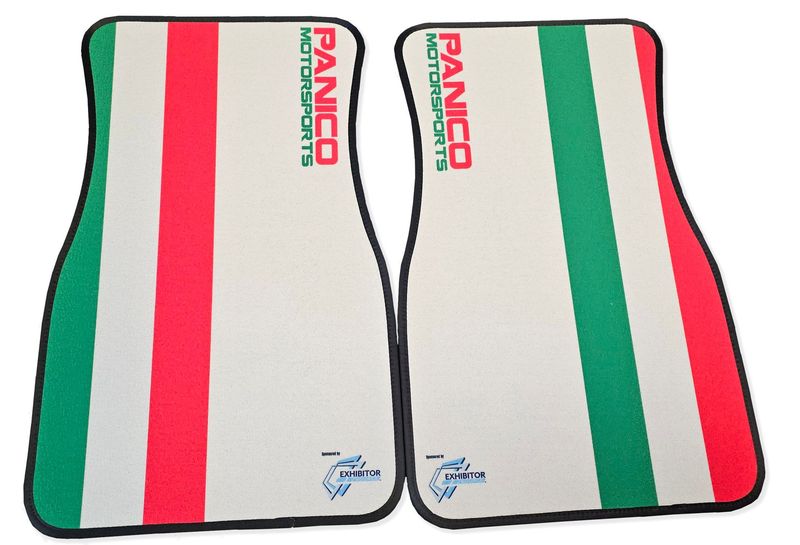
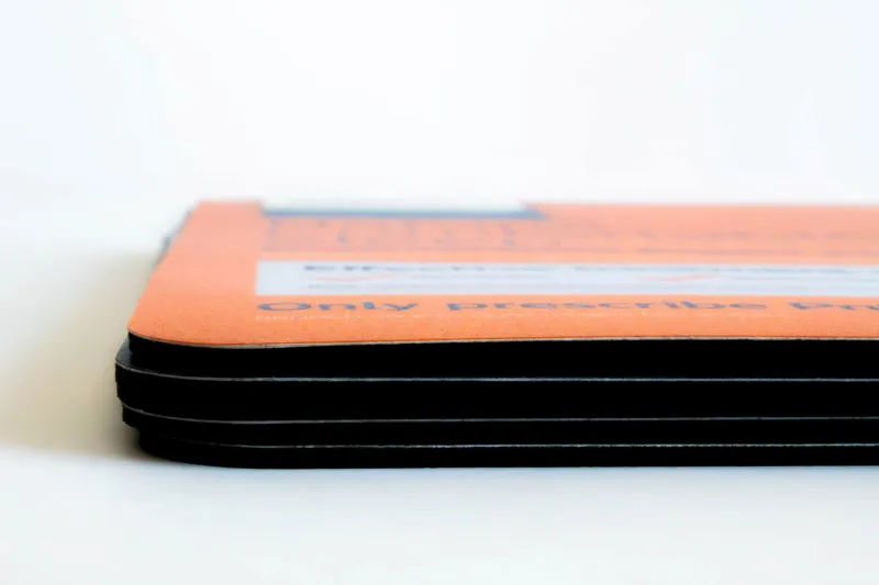
At LamPro Industries, we understand the importance of accurate colour reproduction through expert colour management printing. Whether you need business cards , counter mats , or large format prints , our colour management expertise ensures your brand colours come out exactly as you intended.
Conclusion: Making the Right Choice for Your Colour Management Printing Projects
Ultimately, mastering colour management printing requires a deep understanding of your project's goals and the tools at your disposal. Whether you're a designer or running a print shop, making informed decisions about colour spaces and management policies is key to delivering high-quality, consistent results. By carefully considering your colour management printing strategy, you can overcome the challenges of colour consistency and ensure that your designs look as stunning in print as they do on screen.
Ready to Bring Your Designs to Life with Perfect Colour?
Ready to bring your designs to life with perfect colour? Request a quoteorcontact our teamto discuss your next project.
Frequently Asked Questions About Colour Management Printing
❓ What is the difference between RGB and CMYK in colour management printing?
RGB (Red, Green, Blue) is for screens and digital displays. CMYK (Cyan, Magenta, Yellow, Black) is for print. Proper colour management printing converts RGB designs to CMYK accurately so what you see on screen matches the final printed piece.
❓ Why does my printed colour look different than on my screen?
This is the most common challenge in colour management printing. Screens emit light (RGB) while printed materials reflect light (CMYK). Calibrated monitors, proper colour profiles, and working with experienced print professionals minimize these differences.
❓ Can you match Pantone colours with standard printing?
Yes! With advanced colour management printing and our 5th colour station technology, we can accurately match most Pantone colours. Specialty neon, metallic, and UV inks are also available for precise brand matching.
❓ What file format is best for colour management printing?
PDF is the preferred format for colour management printing. Ensure your PDF includes embedded ICC profiles, 300 DPI resolution, and CMYK colour mode for the most accurate results.
Featured Products


Read More...