Pantone's "Cloud Dancer": Or, As We Call It in Cleveland, "5 O'Clock Snowstorm"
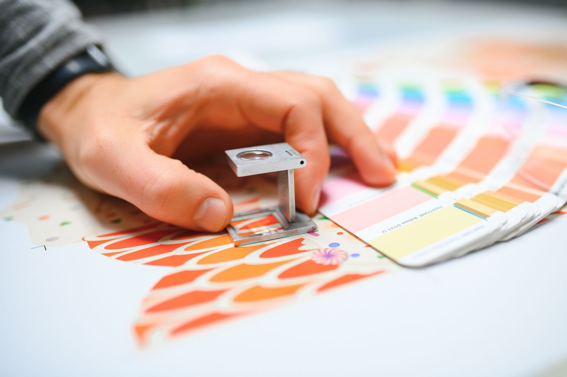
PANTONE 11-4201 "Cloud Dancer."
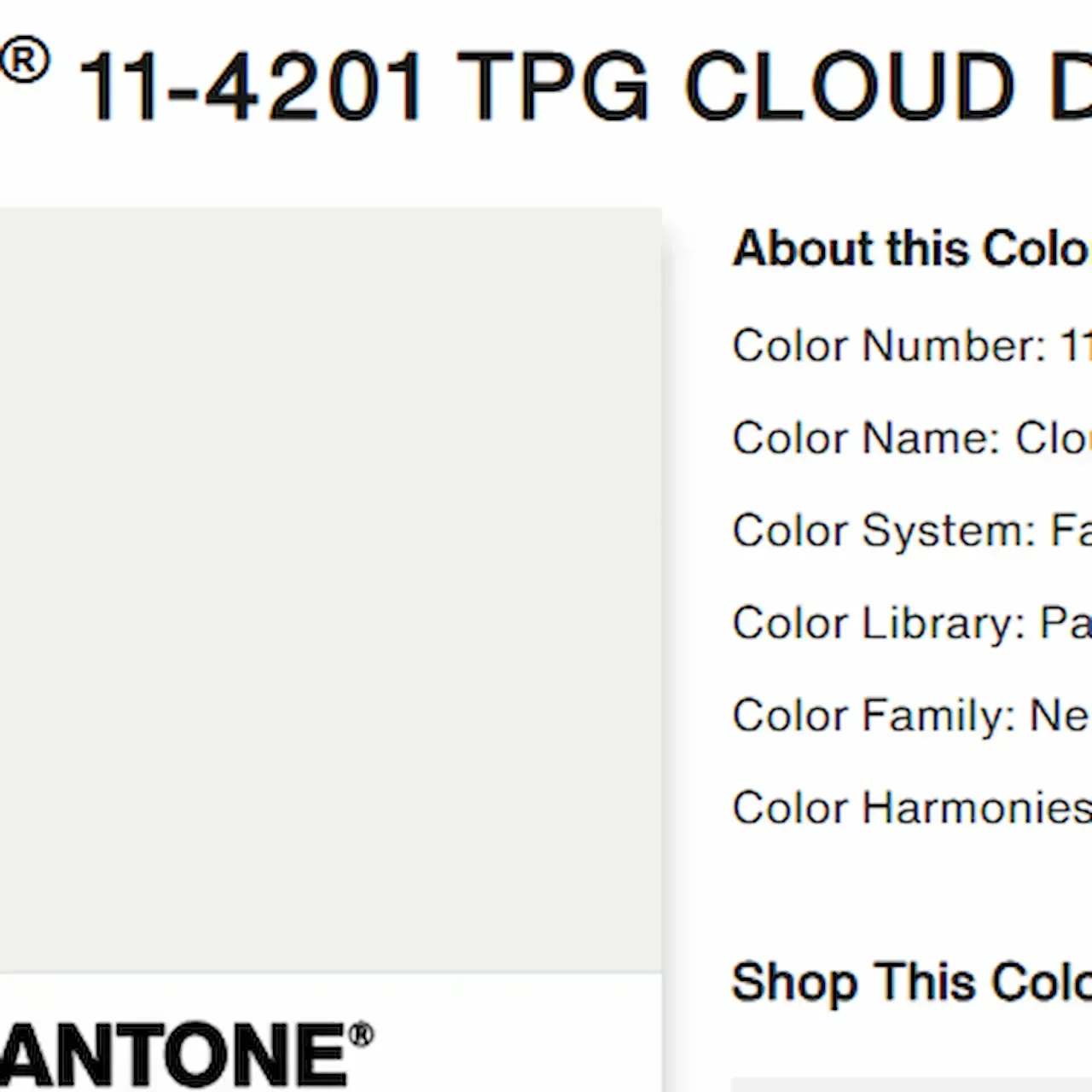
Alright, everyone. Brace yourselves. The oracles at Pantone have spoken, and the Color of the Year is not a color. It’s a vibe. It’s a feeling. It’s the ghost of a marshmallow in a well-lit room. Say hello to PANTONE 11-4201 Cloud Dancer.
“A weightless and wistful white,” they say. A “diaphanous shade” that encourages “mindfulness and reflection.” I look at it, and I reflect on whether I forgot to change my HVAC filter. It’s the white of a brand-new apartment before you move in your questionable life choices. It’s the color of “optical brighteners” on your detergent box.
This, of course, took me on a nostalgia trip back to design school, where a professor shared a story that forever warped my perception of client color requests.
He had a client—let’s say it was for a local bakery’s logo—who was dead-set on a specific blue. No swatch, no reference. Just a feeling. The design team presented every blue under the sun: Cobalt, Cerulean, Azure, Periwinkle (a bold choice). Rejected. All wrong.
Finally, in a fit of inspired frustration, the client slammed a hand on the table and declared: “I want 5 O’CLOCK BLUE!”
The room fell silent. My professor, a pragmatic Midwesterner, took a deep breath. His first question wasn't about saturation or hue. It was:
“Well, what color is that? We live in Cleveland, Ohio. ‘5 o’clock’ in January is pitch black. In July, it’s a bright, hazy gold. That ‘blue’ could be a gloomy dusk, a clear evening twilight, or the specific shade of existential dread that settles in at the end of a Tuesday in February.”
The client, of course, looked at him as if he’d asked for the chemical composition of "cozy." The disconnect was absolute. “5 O’Clock Blue” was a pure, Platonic ideal in the client's mind, utterly untethered from the rotating celestial disco ball we call the sun, or our planet’s tragic axial tilt.
This is why Cloud Dancer is sending me. It’s the exact same energy.
This isn’t just a white. It’s a suggestion. It’s a dance. It’s what happens when you ask an AI to paint "the concept of ethereal." It’s the visual equivalent of the legendary client note immortalized by channels like OffRegistar—you know the one, where the designer is simply told the pink needs to be “more luscious.” Just… inject some lusciousness into the pixels, Karen. The button isn’t weeping with desire yet.
So, in the spirit of regional specificity my professor championed, I’d like to propose some alternate, more grounded names for PANTONE 11-4201:
- Winter in Cleveland: Not the snow. The snow’s bright. This is the color of the sky at 3:45 PM on December 10th, when the sun gave up hours ago and the world is just a diffuse, damp blanket of “meh.” It’s the white of slush that has settled into a philosophical gray area between solid and liquid.
- 5 O’Clock Snowstorm: The specific off-white of the office window when the big flakes start coming down right at quitting time, and your “bright, clean drive home” fantasy evaporates into a monochrome panorama of brake lights and despair. It’s hopeful, yet resigned. Weightless, yet oppressive. Perfect.
- Premium Printer Paper (After You've Already Printed the Important Thing): You know it’s not pure white, but you can’t prove it.
- The ‘We’ll Just Use the Builder-Grade Primer’: The color of every rental property ever. Soothingly neutral or soul-crushingly bland? Yes.
Do I hate Cloud Dancer? Of course not. It’s fine. It’s pleasant. It’s a safe choice in a world that feels increasingly… chromatically volatile.
But do I also want to gently poke it with a stick for being the design world’s most elegant non-answer? Absolutely. It’s “5 O’Clock Blue” for people who do yoga. It’s “more luscious” translated into corporate wellness-speak.
In the end, maybe my professor’s client was onto something. Maybe we should all be naming colors after impossible, personal moments. I’m holding out for next year’s selection: PANTONE 16-1530 “Sunday Evening Dread,” or the ever-popular PANTONE 12-4602 “Does This Make My Kitchen Look Bigger?”
Until then, I’ll be over here, mindfully reflecting on the wistful, diaphanous shade of my slightly-dingy refrigerator. It’s very now.
Ready to bring some wistful weightlessness to your workspace?
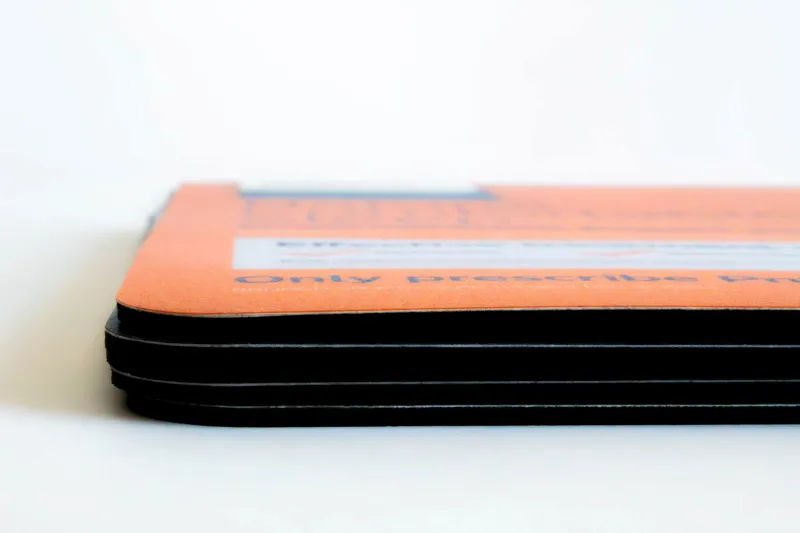
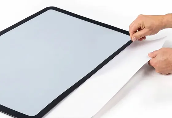
Get the look with our counter mats printed on durable Synthetic Paper in our proprietary shade: "Cleveland Snowstorm White."
From lift-top to insert mats , we’ll help you work up a storm—a perfectly calm, slightly off-white, totally-not-5-o’clock storm.
Learn more about
Custom Counter Mats,browse our portfolio, orrequest a quotefor your next project!

