Pro-Tip: Get a Perfect Print Every Time
Ask Your Printer for Their PDF Settings!

You’ve put hours into a design, and you want the final printed piece to look exactly how you envisioned it on your screen. The secret to achieving that isn't just a great design—it's a perfectly prepared file.
While we covered why we need your PDF for a quote , this guide will show you how to create the ideal file. And the best first step? Simply ask your printer for their recommended PDF export settings.
Here’s why this small ask is a game-changer.
The Magic of a Pre-Set PDF Profile
Many commercial printers, including ours , can provide a small file called a PDF preset or .joboptions file. This isn't just a list of instructions; it's a pre-configured export setting you can load directly into Adobe InDesign or Illustrator.
What this does for you:
• Eliminates Guesswork: No more wondering about the right resolution, bleed, or color space. The preset handles it all.
• Prevents Common Errors: It automatically avoids pitfalls like embedding RGB images or using spot colors unintentionally.
• Saves You Time: You can set it once and use it for every project you send to that printer, ensuring consistency.
Using your printer's specific preset is the closest thing to a guarantee that your file will pass pre-press checks without a hitch.
Beyond the Preset: Your Checklist for a Print-Ready PDF
Whether you use a preset or manually set your document, here’s what to check before you hit "Export."
1. Color Space: CMYK vs. RGB (This is a Big One!)
This is the most common source of color surprises.
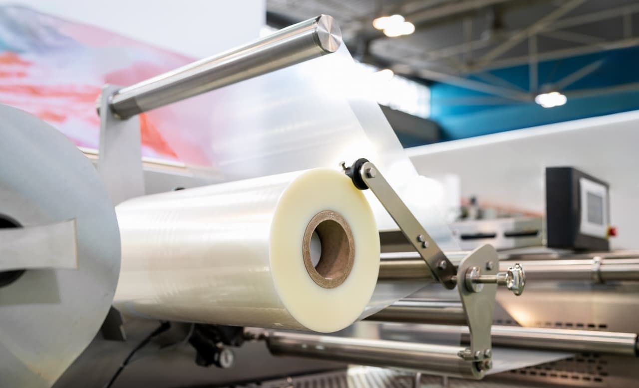
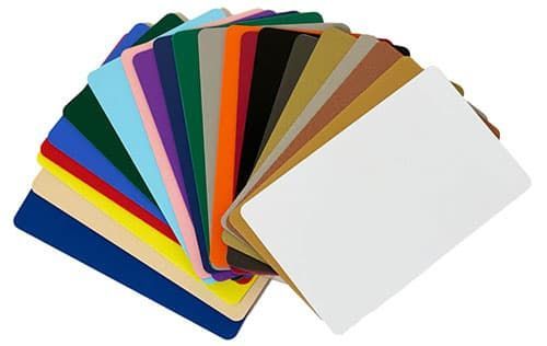
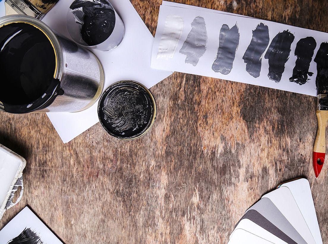
•CMYK (Cyan, Magenta, Yellow, Black): This is the color mode of ink on paper. Most sheet-fed commercial printers are CMYK devices. If you design in RGB (the color mode of screens) and convert to CMYK during export, colors can shift—often making vibrant blues and greens look more muted.
•RGB (Red, Green, Blue): Some modern digital printers, especially high-end ones, can actually process RGB files. In these cases, the printer's RIP (Raster Image Processor) does a sophisticated conversion that can sometimes access a wider color gamut than standard CMYK, resulting in more vibrant final colors.
The Pro-Move: Ask your printer which color space they prefer! If they use CMYK, design and export in CMYK from the start to maintain color control. If they support RGB, you might be able to achieve those brighter, more saturated colors you designed on your screen.
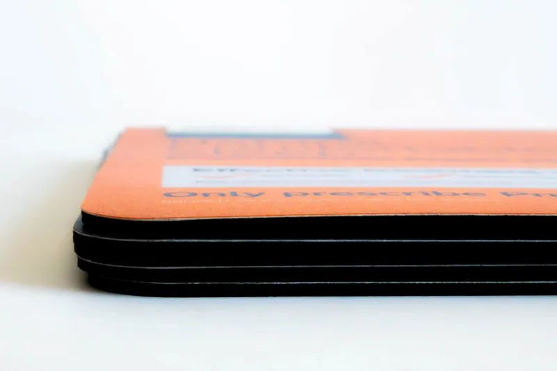
2. Don't Forget the Bleed!
As we mentioned before, bleed is crucial for a professional finish.
•Set it in Your Document: In your design program (like InDesign), set a bleed of 0.125 inches (or 3mm) on all sides before you start designing.
• Include it in Export: When exporting your PDF, make sure the "Marks and Bleeds" tab is set to use the document bleed settings and to include crop marks.
This gives us the extra room we need to trim the paper without any risk of white edges.
3. Resolution and Fonts
• Image Resolution: All images and graphics should be at least 300 PPI (pixels per inch) at their final print size. The PDF preset will usually handle this, but it's good to check your images beforehand to avoid pixelation.
•Embed Fonts: Always embed all fonts. A PDF preset will do this, but if you're checking manually, ensure your fonts aren't being subsetted at less than 100% (which can cause issues with some RIPs).
Your Action Plan for Flawless Printing
1. Before you design, contact your printer and ask: "Do you have a custom PDF export preset I can use, and do you prefer CMYK or RGB files?"
2. Apply their preset or use their specifications to set up your document from the very beginning.
3. Before sending your final PDF, do a quick visual check. Zoom in to see if images are crisp, and check that the bleed and crop marks are present.
Taking these steps does more than just prevent errors; it puts you in the driver's seat. You have the knowledge to ensure your creative vision translates perfectly from the screen to the printed page, on time and on budget.
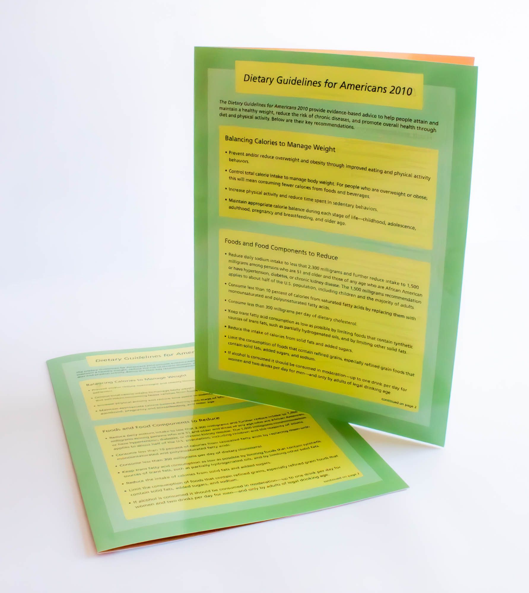
Ready to print? Browse our products,view our portfolio, orrequest a custom quote.
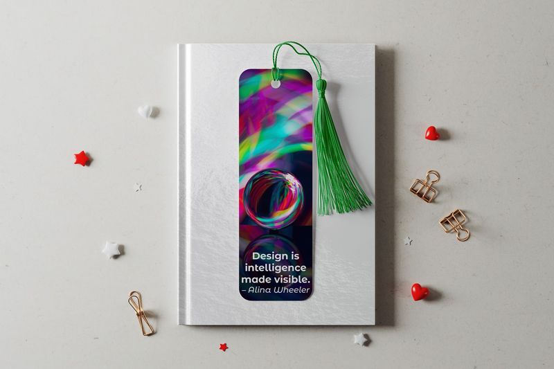
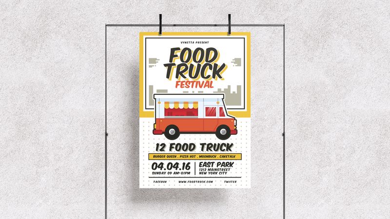
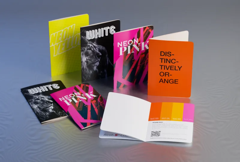
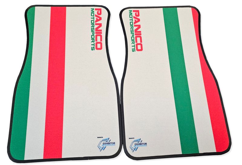
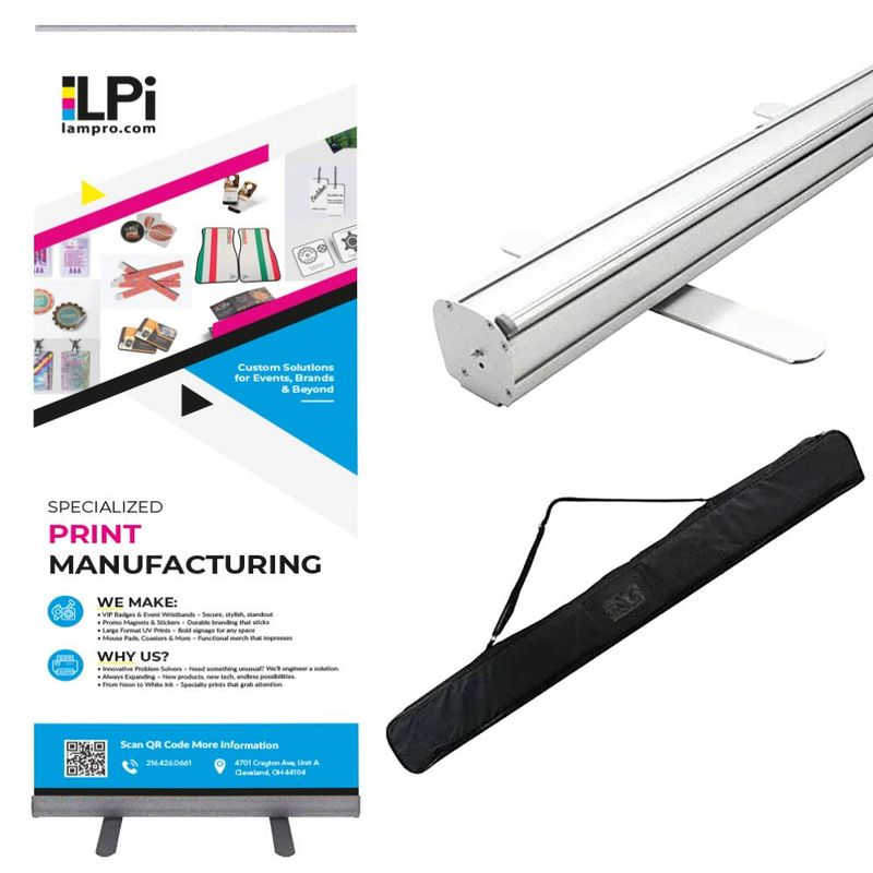
Featured Products


Read More...