Understanding the Evolution and Importance of Color Management in the Print Industry
Understanding the Evolution and Importance of Color Management in the Print Industry
What Is Color Management in Printing?
Color management in printing is the process of controlling color reproduction across different devices (monitors, printers, presses) to ensure consistency and accuracy. It involves color spaces (RGB, CMYK, Lab), calibration standards (GRACoL, G7), and technologies like expanded gamut printing and 5th color stations. Proper color management in printing ensures your brand colors look exactly as intended on every printed piece. Request a color consultation →

In the ever-evolving world of print technology , color management in printing plays a crucial role in ensuring consistency and quality across various print projects. Many people might not be familiar with terms like GRACoL, G7, or expanded gamut printing, but these standards and techniques are the backbone of modern printing, ensuring that colors appear as intended on different materials and devices. In this blog, we will explore the history and benefits of these color management in printing standards, delve into the technical advancements in the print industry, and discuss the powerful capabilities of print technologies like the 5th color station.
The Evolution of Color Spaces and Their Importance in Color Management
A Brief History of Color Management in Printing
Color spaces have been developed over the years to address the need for accurate and consistent color reproduction. Here's a look at some of the key milestones:
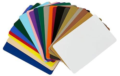
- RGB (Red, Green, Blue): Initially used for digital displays, the RGB color space is essential for any screen-based design. It combines red, green, and blue light in various intensities to create a wide range of colors.
- CMYK (Cyan, Magenta, Yellow, Key/Black) : Developed for print, the CMYK color space uses a subtractive process to combine cyan, magenta, yellow, and black inks. This model is fundamental for achieving a broad color range in printed materials.
- Lab Color Space: Introduced as a device-independent model, the Lab color space closely approximates human vision and provides a consistent reference for color management in printing, regardless of the device.
- Expanded Gamut Printing : This technique adds additional inks (such as orange, green, and violet) to the standard CMYK set, allowing for a more extensive and accurate color range.
Color Management Standards: GRACoL and G7
The Need for Color Management Standards
The print industry recognized the need for standardization to ensure color consistency and quality across various printing processes and devices. This led to the development of several key standards:
- GRACoL (General Requirements for Applications in Commercial Offset Lithography): GRACoL provides a comprehensive set of guidelines for commercial offset printing, ensuring high-quality color reproduction. For more information on GRACoL, visit theIdealliance website.
- G7 Method: Developed by Idealliance, the G7 method focuses on calibrating printing presses and proofing systems to achieve a common visual appearance. It is based on gray balance and tonality, enabling consistent color output across different platforms. Learn more about G7 on theIdealliance website.
These standards help reduce waste, improve efficiency, and ensure that printed materials meet the desired quality.
Technical Advancements in Color Management for Printing
Recent Innovations in Color Management in Printing
Recent years have witnessed significant advancements in print technology, particularly in color management in printing:
- G7 and GRACoL: These standards have been widely adopted, providing a common framework for achieving consistent and accurate color reproduction.
- 5th Color Stations : Technologies like the 5th color station, as seen in printers like the Ricoh C7500 Pro , have revolutionized color matching. The addition of neon and spot colors enables printers to achieve colors that are challenging with standard CMYK. This capability is invaluable for maintaining brand consistency and creating special effects such as metallic inks and clear varnishes.
The Power of 5th Color Stations in Print Projects
Enhancing Color Matching and Vibrancy
- Neon and Spot Colors : The 5th color station allows for the use of neon and spot colors, providing vibrant and attention-grabbing prints. These additional colors help match difficult colors, ensuring accurate reproduction of brand colors and specific design elements.
- Brand Consistency: For businesses, maintaining consistent brand colors across various media is crucial. The 5th color station enables precise color matching, ensuring that logos and branded materials appear consistent and professional.
- Special Effects: Beyond color matching, the 5th color station can be used for special effects, such as printing white ink on dark substrates or adding textures with clear varnishes. These effects enhance the visual appeal and tactile experience of printed materials.
Practical Application: Color Management at LamPro
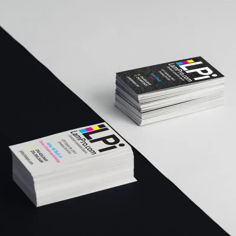
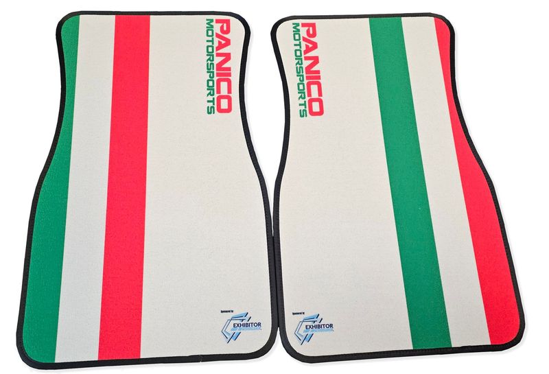
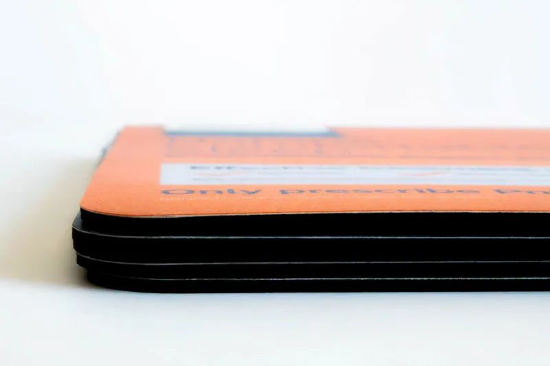
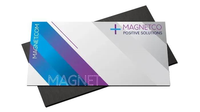
At LamPro Industries , we utilize advanced color management in printing standards to ensure your business cards , counter mats , and large format prints come out exactly as you envisioned. Our color management expertise , combined with professional finishing services , delivers consistent, vibrant results every time.
Conclusion: The Future of Color Management in Printing
The advancements in color management in printing, from the implementation of standards like G7 and GRACoL to the introduction of expanded gamut printing and 5th color stations , have transformed the print industry. These technologies ensure unprecedented accuracy, vibrancy, and consistency in printed materials, making them essential tools for any print project. As the industry continues to evolve, embracing these innovations will be key to maintaining high standards of quality and meeting the diverse needs of customers.
Ready to Put Precise Color Management to Work for Your Brand?
Ready to put precise color management to work for your brand? Request a quote,browse our products, orcontact our color expertsto discuss your next project.
Frequently Asked Questions About Color Management in Printing
❓ Why is color management in printing important for my brand?
Color management in printing ensures your brand colors look identical across business cards, brochures, banners, and promotional products. Inconsistent colors damage brand recognition and professionalism.
❓ What is the difference between RGB and CMYK in color management?
RGB is for screens (digital displays). CMYK is for print (ink on paper). Proper color management in printing converts RGB designs to CMYK accurately so what you see on screen matches the final printed piece.
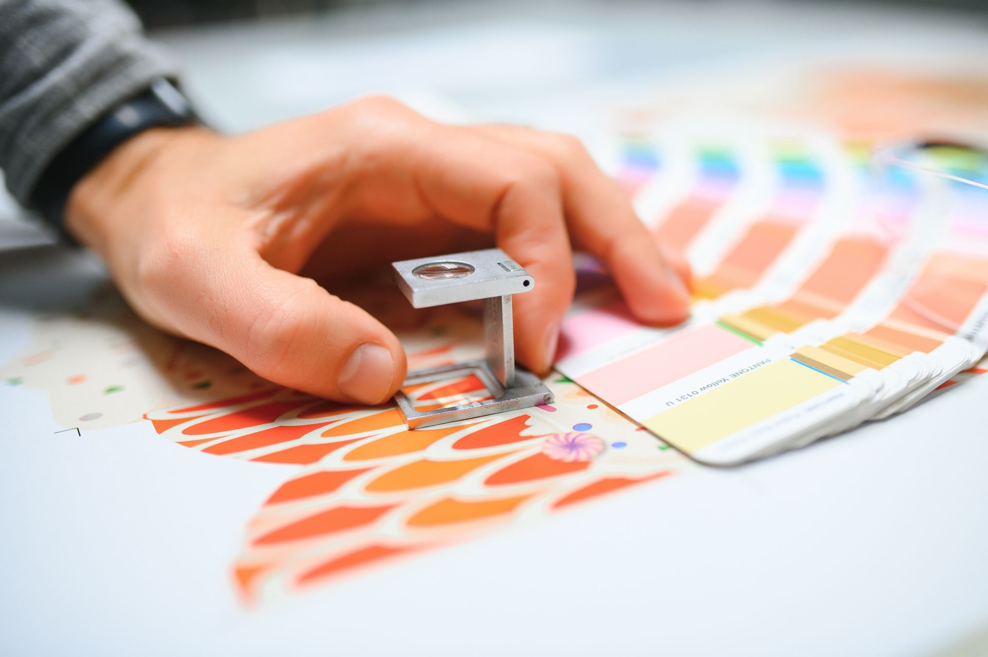
❓ Can you match Pantone colors with standard printing?
Yes! With advanced color management in printing and 5th color station technology, we can accurately match most Pantone colors. Specialty neon and metallic inks are also available for precise brand matching.
Featured Products


Read More...