Color Psychology in Print Marketing: A Guide | Lampro
How to Leverage Color Psychology in Print Marketing for Maximum Impact
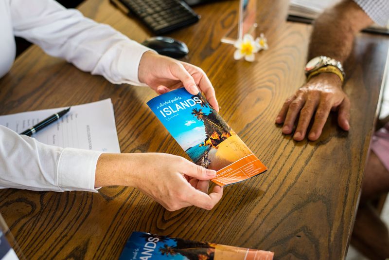
In today’s competitive market, making your brand stand out requires more than just a great logo and catchy slogan. The colors you choose for your marketing materials —whether it's for event badges , countermats , or even laminated business cards —can have a profound impact on how your audience perceives your brand and interacts with your products.
Understanding Color Psychology
Color psychology is the study of how colors affect human behavior and decision-making. Different colors can evoke different emotions and reactions, which is why choosing the right colors for your print marketing materials is crucial. For instance:
- Red often conveys passion, urgency, or excitement.
- Blue can evoke trust, calmness, and professionalism.
- Green is associated with health, tranquility, and eco-friendliness.
By understanding these associations, you can better tailor your print materials to align with the message you want to convey.
Applying Color Psychology to Print Marketing
When it comes to print marketing, color isn't just about aesthetics—it's about driving action. Here’s how you can apply color psychology to some of the most popular print products:
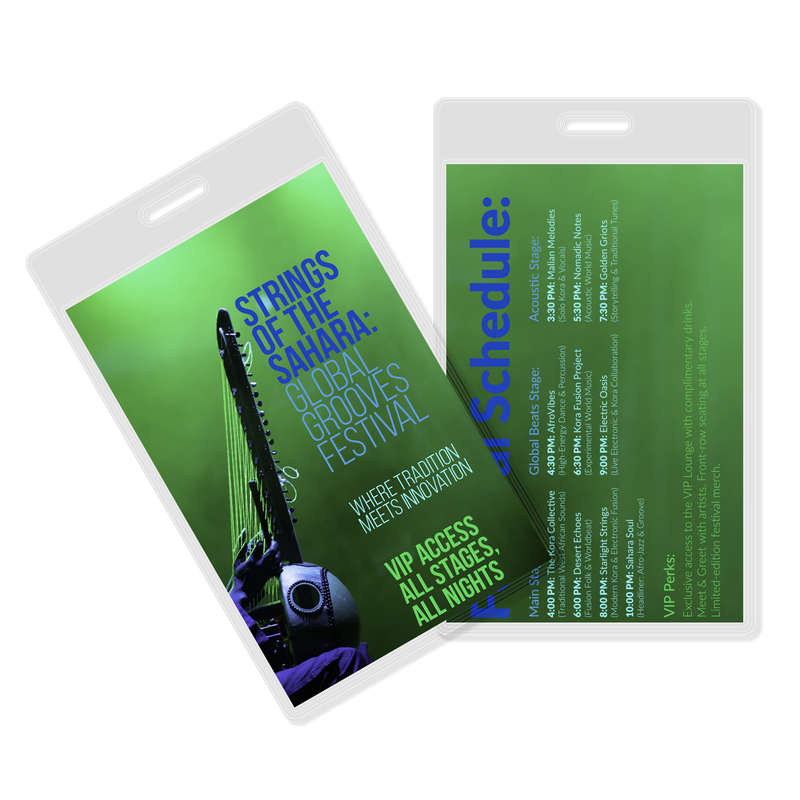
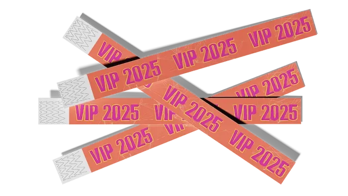
Event Badges
Whether for a conference, trade show, or company event, event badges are a key part of your branding. Use bold colors like red or orange to grab attention, or opt for calming blues to create a professional and trustworthy atmosphere. If you want to highlight sustainability, green hues can subtly reinforce your commitment to eco-friendly practices.
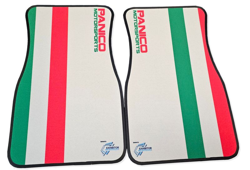
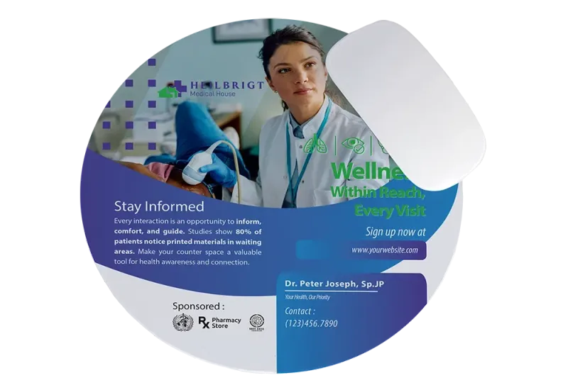
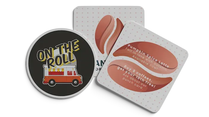
Countermats
Countermats are often used in retail settings where they need to stand out amidst a sea of other promotional materials. Consider using bright, contrasting colors that reflect your brand’s identity. Yellow, for example, is known to capture attention and can be perfect for impulse-buy promotions. Browse our custom counter mat options to find the perfect fit for your brand.
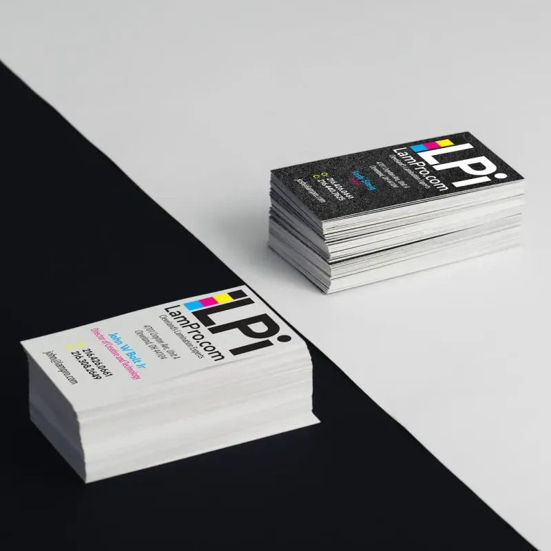
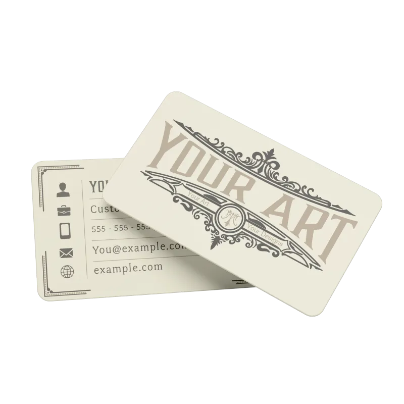
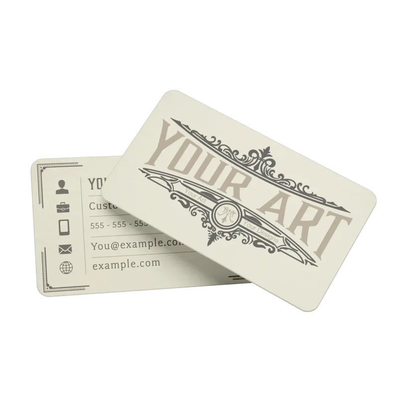
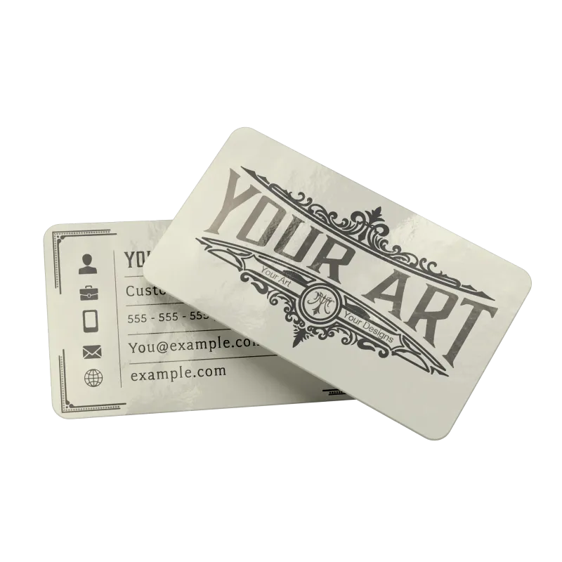
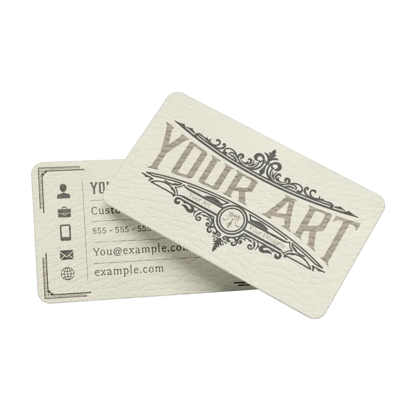
Business Cards
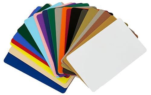
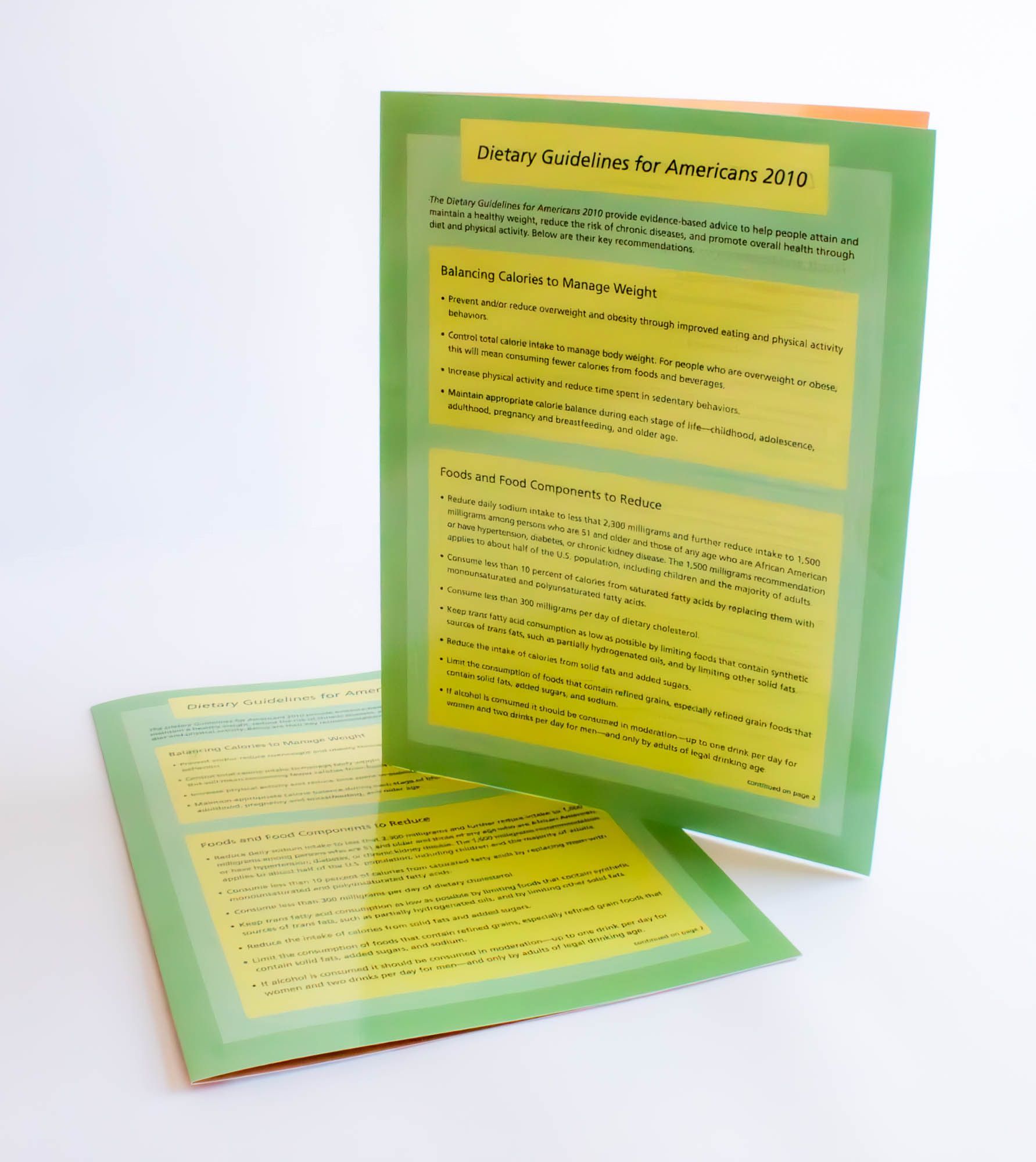
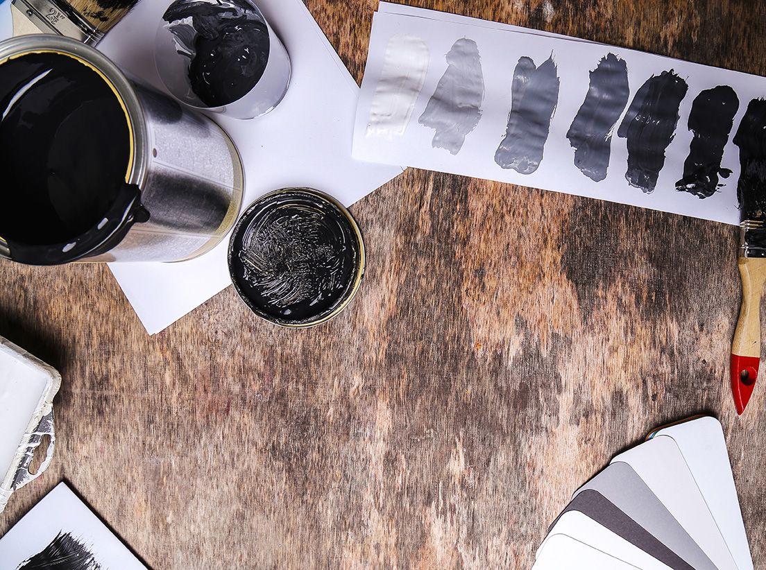
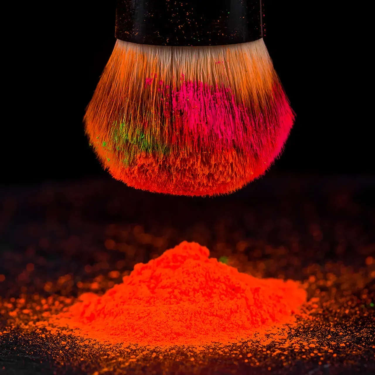
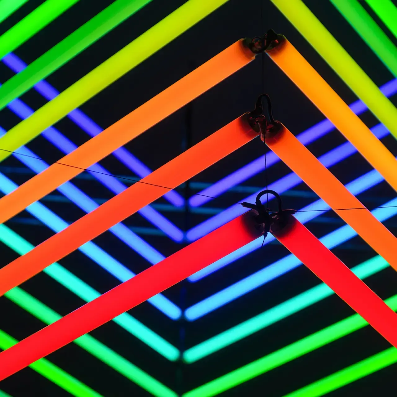
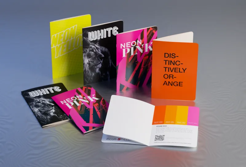
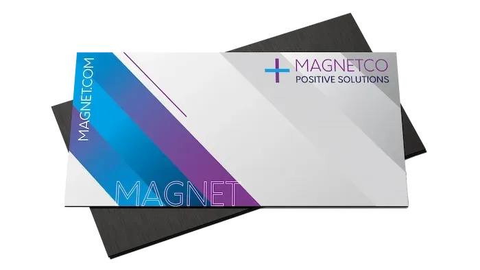
Your business card is often the first tangible connection someone has with your brand. Choosing a color scheme that reflects your brand's core values can make a lasting impression. For a sleek, modern look, black and white with a pop of color can convey sophistication. Meanwhile, using bright colors like neon pink or green can showcase creativity and innovation.
With the addition of neon colors in the 5th color stations of modern digital printers, the color gamut is significantly expanded. This means that your prints can achieve even more vibrant and eye-catching colors that were previously difficult to produce. This expanded capability allows for greater creativity and impact, making your business cards truly stand out in a crowded marketplace.
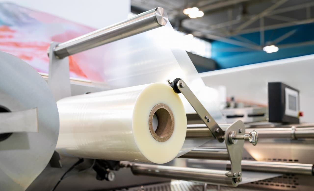
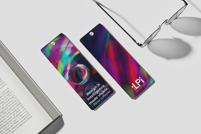
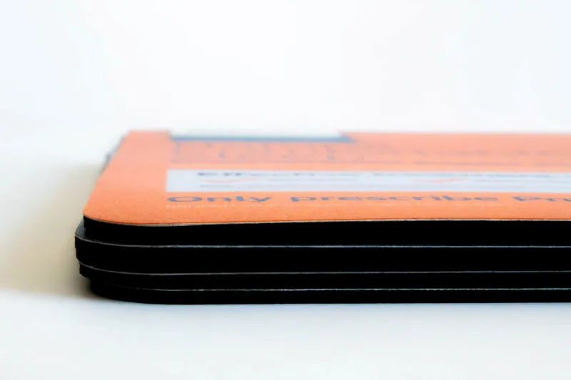
Lamination: Enhancing Color and Durability
While color plays a key role in the effectiveness of your print materials, lamination can further enhance the vibrancy of those colors while also protecting your investment. Laminated countermats or event badges not only look more polished, but they also stand up better to wear and tear, ensuring that your brand’s message remains bold and clear over time. Learn more about our lamination and finishing services.
Final Thoughts: Color Matters More Than You Think
Incorporating the principles of color psychology into your print marketing strategy can significantly boost your brand’s visibility and effectiveness. Whether you’re designing countermats , event badges , or any other printed material, the colors you choose can influence customer perceptions and actions in subtle but powerful ways.
And with advancements in digital printing, such as the use of neon colors in 5th color stations , your options for creating vibrant, attention-grabbing prints are broader than ever. By making informed choices about color, and considering options like lamination for added durability, you’re not just creating something visually appealing—you’re crafting an experience that resonates with your audience.
Ready to put color psychology to work for your brand? Browse our products,request a custom quote, orcontact our color expertsto get started.
Featured Products


Read More...